Windows 8.1: My Opinion Elaborated
Author: Koroush Ghazi
Last Modified: September 2013

Introduction
Quite a few people have written to me expressing surprise at, and in many cases, support for, my rather blunt outburst against Windows 8.1, posted earlier in the week. To recap, here is what I posted on 3 September 2013, on the front page of my site:
Over the last few days I've been quite busy installing and exploring the Windows 8.1 RTM ISO that was recently leaked. I don't normally condone the use of leaked software, but in this case, given it's ultimately a free upgrade, and the fact that I need to get across the changes as soon as possible so I can update the TweakGuides Tweaking Companion for Windows 8, I thought it justified.
My impression of Windows 8.1 can be summed up in two words: extremely disappointing. The march towards tabletizing a Desktop OS continues, as Windows 8.1 hides or completely removes several potentially useful Desktop features, while gussying up the Metro interface. If you're also not vigilant during installation, you will automatically be opted into using Bing ad-driven searches, SkyDrive integration and a Microsoft Account. The only unambiguously positive changes are the addition of options to boot straight to Desktop, and disable the hot corners, neatly hidden away under the Taskbar Properties>Navigation tab I might add. Fortunately, workarounds exist for some of the changes, and of course Start Menu replacement utilities, along with other Windows 8 customization tools, will provide further options.
I don't normally like to post opinions, especially negative ones, on the front page. In this case, I can't resist, as this bastardization of Windows makes me quite angry. Having used every version of Microsoft's operating systems since 1988 (MS-DOS 5.0), this is the first time I truly believe that Microsoft has lost its way. To put it bluntly, Windows 8.1 is a mish-mash of interfaces, and in some cases borderline deceptive options, mainly to serve Microsoft's dubious ambitions in the mobile device arena, rather than consumers and businesses. It will only serve to further confuse and alienate the average PC user, and hasten the PC's demise. I've used Windows 8 as my daily OS since the Preview back in June 2012, and I can honestly say it seems like one step forward, four steps back when compared to Windows 7.
In any case, I am currently detailing all of the changes and attempting to provide revised best practice usage recommendations in an update to the TweakGuides Tweaking Companion for Windows 8. I will release the updated version shortly after the official release of Windows 8.1.
I want to clarify something: I'm not in the habit of blindly criticizing changes in Windows, and this was not just another generic ill-considered anti-Windows 8 rant, which are a dime-a-dozen on the Internet. If all I wanted to do was have a pot-shot at Windows 8, I could have done so over a year ago, when I was using the Release Preview version, and subsequently, when I sat down for several months and wrote the TweakGuides Tweaking Companion for Windows 8 book. I wasn't terribly thrilled with Windows 8 at any time over that period, but I always maintained some faith that Microsoft would set things right, once they saw the widespread negative feedback translate into relatively poor sales.
People should also keep in mind that I don't have a history of attacking Microsoft. Quite the contrary, I was one of the few people defending Windows Vista, when almost everyone else was still cashing in on the anti-Vista craze. I wrote the lengthy Vista Annoyances Resolved article, which not only attempted to debunk many of the silly untruths about Windows Vista, it also went further by providing some practical solutions to common problems.
So what prompted my outburst against Windows 8.1? Allow me to explain in detail.
Windows 8 101
Let's pause for a moment to bring people who don't use Windows 8 up to speed. Windows XP, Vista and 7 users who are reading this article just out of curiosity need to be reminded of the schizophrenic nature of Windows 8's user interface, and the rationale behind it.

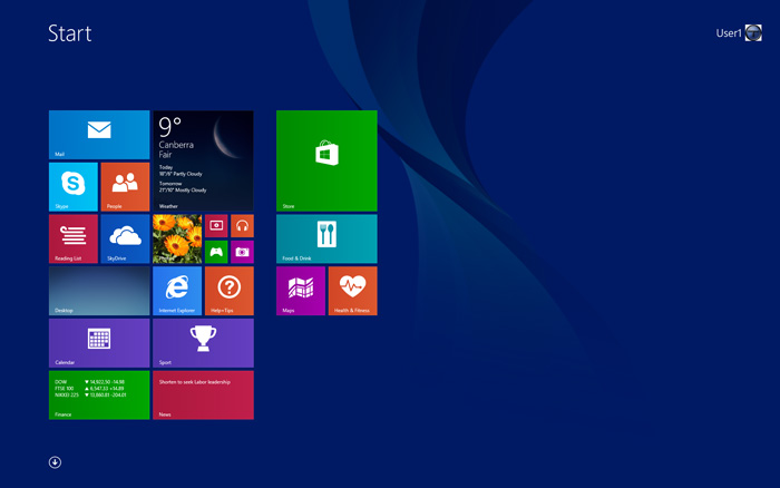
In a nutshell, Windows 8 (and 8.1) has two distinctly separate interfaces: one is referred to as the Modern UI by Microsoft, but was originally dubbed Metro, and that name has stuck. As shown above, it's a minimalistic multi-colored interface that is designed primarily with touch interfaces in mind. That is, it's mainly aimed at smartphones, tablets, and similar touch-enabled devices. Instead of icons it has large tiles, and doesn't allow free-floating Windows or complex hierarchical menus, or any fancy visual effects, because these are not touch-friendly, and may also run poorly or use up too much battery life on mobile devices. Any programs in the Metro environment (called Apps) can only be installed or updated via the Windows Store.

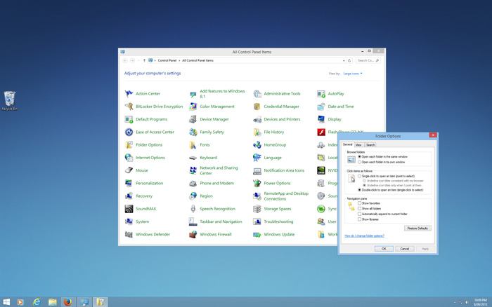
The second interface is the normal Windows Desktop which most Windows users would have become accustomed to over the past 15 years or so. It's a bit simpler in appearance in Windows 8 by default, as shown above, since Desktop Gadgets have been removed, Windows Aero Glass effects have been removed, and there is no Start Menu.
These two interfaces are notionally separate, as really they serve two separate needs - mobile devices vs. full-powered PCs. But Microsoft has forcibly joined them together by making some critical options and features unique to each environment. For example, there is no full-featured file browser in the Metro interface, so Metro users on PCs still need to switch to the Desktop to use File Explorer (previously called Windows Explorer). Similarly, users who want to stay in the Desktop environment typically need to use the Metro interface for launching searches using Windows Search. In either case, the user is often shunted from one interface into another for no other reason than because Microsoft wants it to be this way. There is no logical workflow or technical reason for this merging of the two interfaces.
Why has Microsoft really done this? Well, having seen the types of profits that companies like Apple have made with their mobile devices and their Walled Garden environments, Microsoft has decided that it too wants a piece of this pie. It is quite obvious that at some point, the decision was made by Microsoft management that users should not be given the option to isolate themselves on the Desktop, and should instead be given no alternative to using the new Metro environment, in the hopes that they will become accustomed to it through lack of choice. To that end, Windows 8, and now 8.1, constantly tries to force users into the Metro environment, such as by removing the Start Menu, making almost all default file handlers use the relevant Metro apps instead of the Desktop versions, even if a file is launched from the Desktop, and whole host of other - I can't resist saying this - annoying, short-sighted, purely profit-driven, feature and interface changes.
Let's cut to the chase. Having written a book on Windows 8, I can honestly say that I can't find a single significant interface change in Windows 8, and certainly numerous feature changes, that have any basis in logic or the desire to improve the user experience for PC users. There are only two unambiguous feature improvements in Windows 8: the new Windows Task Manager, and the improved file transfer dialog box. The vast majority of the changes in Windows 8, and moreso Windows 8.1, are designed purely to lure people into the Metro environment, so Microsoft can cash in on Windows Store purchases, and associated mobile device sales. It really is as simple as that. And it really is surprising just how blatant Microsoft has been in ignoring user wishes to the contrary.
What's not so surprising is that this rather bold approach to herding desktop PC users onto the same pasture as mobile device users has unequivocally backfired on Microsoft. Despite significant price incentives, particularly in the early days of Windows 8's release, when a copy of Windows 8 Pro Upgrade could be had for as little as $15, the adoption rate for Windows 8 is floundering.

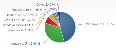
As at September 2013, almost a year after its release, estimates of Windows 8's market share place it at around 7.4%. The graph above shows that Windows 7 and XP still vastly outstrip this, at 45.6% and 33.7% respectively. But more telling is the fact that over the same period since their respective releases, as this article notes, Windows Vista had a 7.3% market share, and Windows 7 had a whopping 17.3% share. So in relative terms, although Windows 8 is hardly an outright flop, it's clear that Microsoft's strategy really isn't working out very well.
Faced with a situation where an OS isn't selling well, and with mounting criticism from all quarters, pointing squarely to the dislike of the Metro interface, what does Microsoft do? It offers up a free Windows 8.1 upgrade to all Windows 8 users, promising to substantially refine the Windows 8 experience. This is welcome news to everyone. Hopefully now we'll have more choice as to how we can configure Windows 8, and for those who want it, a way to get as far away from using Metro as possible.
But that's not how Windows 8.1 has panned out.
